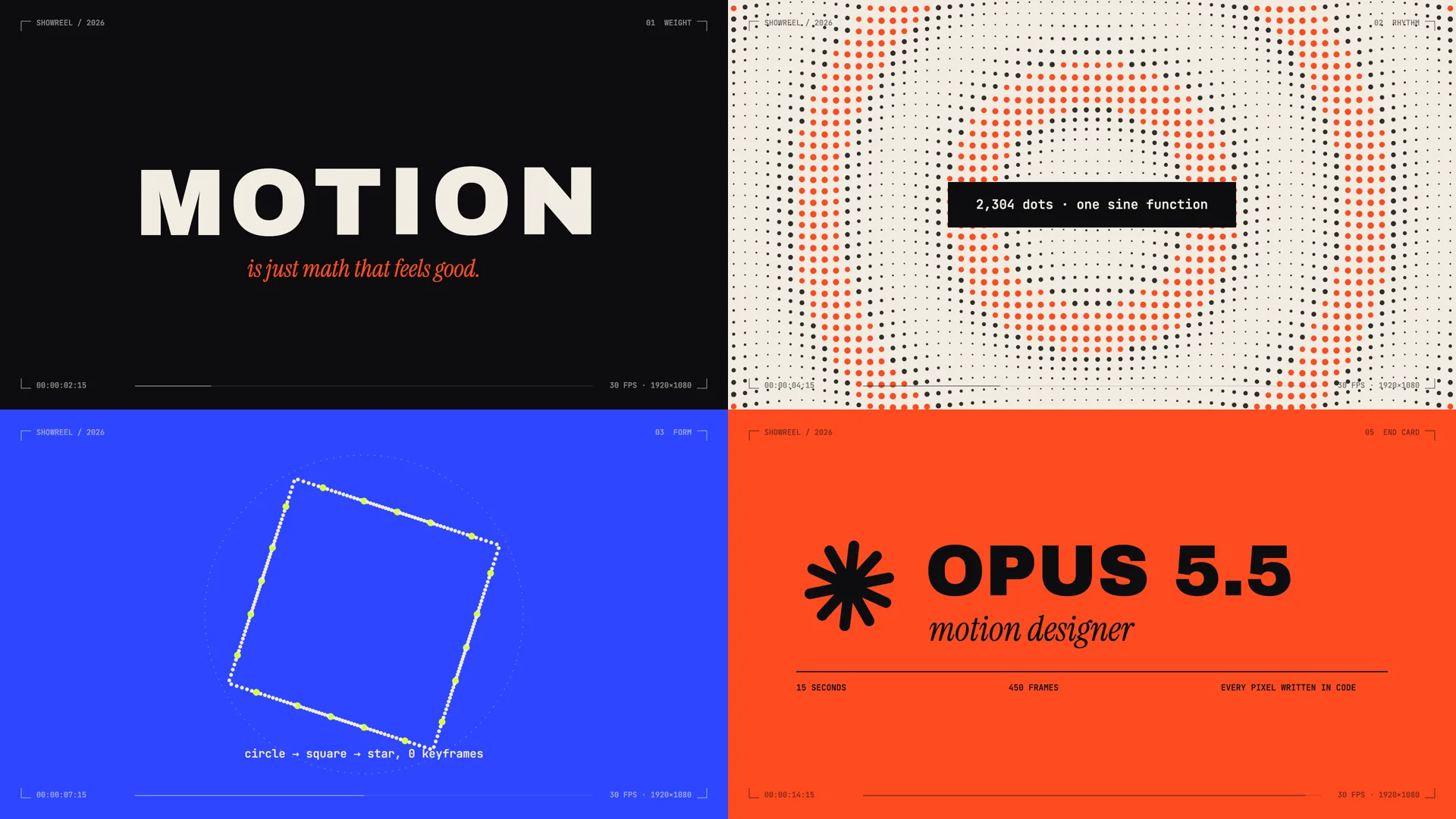
An Opus 5.5 video is an animation that Claude Opus 5.5 writes as code, which a browser then draws frame by frame and saves as an MP4. That is why the best ones look like motion design: sharp type, exact colors, interface mockups, charts, and transitions that turn one shape into the next.
Across 475 public Opus 5.5 videos, about six in ten are motion graphics, four in five are 16:9 landscape, and the median length is 30 seconds.
What Makes an Opus 5.5 Video Different
Opus 5.5 does not paint pixels the way Veo, Kling, or Seedance do. It writes a self-contained HTML file using Canvas, SVG, CSS, GSAP, or Three.js, and a headless browser renders that file one frame at a time before ffmpeg encodes the result (Hugging Face walkthrough, Claude Video index). Canvas is the most common choice, used in 336 of those 475 videos, followed by SVG in 193 and Three.js in 141. The Opus 5.5 announcement page doesn’t mention video; creators found this use on their own.
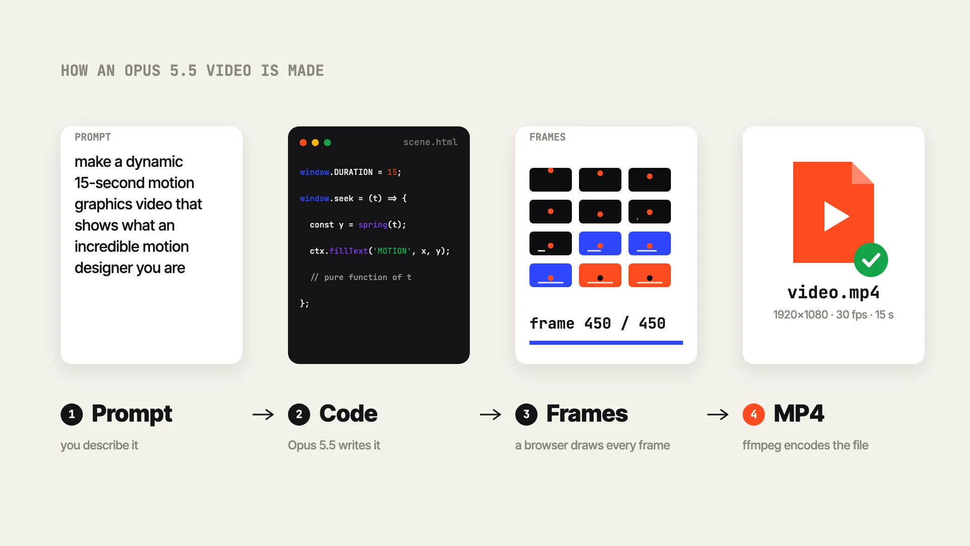
Writing video as code has three practical effects:
- Text stays sharp and colors stay exact. Type is real type, so a hex value in your prompt is the hex value in the frame.
- Edits are cheap. Changing one scene means changing a few lines of code.
- Photorealism is out of reach. Deedy Das, who made one of the examples below, said that for explaining technical ideas, “photorealistic video gen like Seedance is not very useful here” (post).
Without direction, Opus 5.5 tends toward centered text on a gradient background with everything fading in, which is why so many early videos looked alike (Rexan Wong’s breakdown). The strong examples share four traits you can check in a few seconds:
- Pacing changes. Fast cuts sit next to moments that hold for a beat.
- Type has hierarchy: one dominant line, smaller supporting labels, a clear reading order.
- Scenes connect. One shape turns into the next scene.
- It ends on a final card or a clean loop point.
Motion Design Showreels
1. The One-Line Showreel Prompt Dozens of Creators Reused
 Frames from Stephan Livera’s post (16,983 likes, 15 seconds, 16:9).
The prompt is one sentence:
make a dynamic 15-second motion graphics video that shows what an incredible motion designer you are, like it’s your showreel for a résumé. go all out.
Opus framed the result like a design portfolio, with a timecode HUD and chapter labels. One chapter animates six easing curves side by side under “Six ways to get from A to B.” Another fills the screen with a looping tile pattern. A single word snaps in at poster size, then a red end card closes it. The prompt gives a goal, a length, and an ambition level, and leaves every content decision to the model, which makes it a good test of the model and a poor fit for anything about your own brand.
At least 90 public Opus 5.5 videos use this sentence or a close variant, including reels by Ajith (4,057 likes) and Leon Abboud, each with a different look. We gave Opus 5.5 the sentence too:
 The same prompt, run through Opus 5.5: 15 seconds, 450 frames.
Where Stephan’s reel went for easing curves and a tile pattern, ours opened with a bouncing ball that bursts into the word “MOTION,” then moved to a wave of 2,304 dots and a ring of points morphing from circle to square to star.
Product Launch Videos
2. An Inference Startup Launch From One Sentence
 Frames from Deedy Das’s post (3,264 likes, 26 seconds).
make a modern slick and punchy video for a modern startup that works on inference
Deedy never named the company, so Opus invented one. It called it “muda” (Japanese for waste), opened on a user waiting 2.81 seconds for an answer, showed a GPU cluster climbing to 94% utilization, and closed on a logo. Each scene carries a small numbered label, like chapters in a keynote. The arc of problem, product, proof, and name appeared without being asked for. It took Deedy about a minute and roughly $2.
The product, the numbers, and the name are all made up. A real launch needs you to supply them.
3. A SaaS Launch Built From a Real Product’s Assets
 Frames from Moritz Kremb’s post (418 likes, 46 seconds).
Moritz asked Opus to pick a well-known product and pull in real assets:
I want you to create a highly professional SaaS product launch video. Go and find some SaaS, preferably just one that people know, so it’s easier to identify with it. Pick that, and then make sure to get actual assets and images and all of that stuff from the internet.
It picked Notion and followed the familiar launch-film rhythm: “Docs here. Chats there. Tasks everywhere.” over floating app icons, a recreated project board, a feature line with a chart, a row of customer logos, and an end card where a cursor clicks the call to action. Real product context is what makes it feel specific. For your own product, paste in screenshots, your headline, and your feature list. The brand and logos here belong to Notion, so treat this one as a demo.
4. A Photo-Print App Launch in One Continuous Take
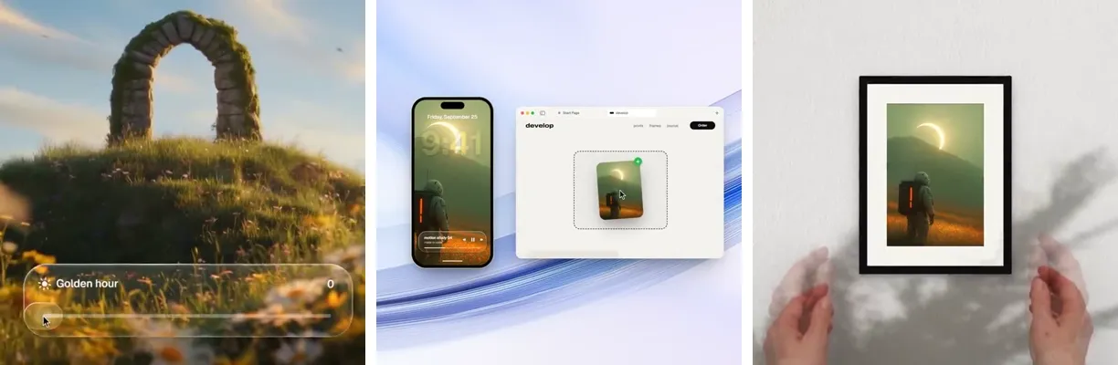 Frames from zero’s post (2,103 likes, 29 seconds, 1:1).
This prompt runs to several thousand characters, split into <inputs>, <direction>, <structure>, <build>, <gotchas>, and <start> blocks. The direction block opens like this:
An Apple-keynote launch film, 2D only, one continuous take. Every scene is made out of the previous one: nothing fades, blurs or cuts. […] Banned: crossfades, blur-ins, brightness “developing”, 3D flips, particles, glows, holds longer than 1s, anything that looks like a template.
A button becomes a photo, a glass slider relights it to golden hour, the image moves from a phone to a browser window, and it ends as a framed print on real footage of a wall. Listing what you don’t want removes the template look faster than adding more adjectives. The prompt also tells Opus to show a beat map and four still frames before it writes the full film. The photos, the music, and the wall footage came from the creator, and the prompt asks for them first.
These three launch videos follow the same arc: hook, product, a few features, end card. Tellcut has an App launch video template that sets up that structure with a headline, three features, and a closing URL, ready for your own details.
UI Animation and App Walkthroughs
5. One Shape Morphing Through Nine UI States
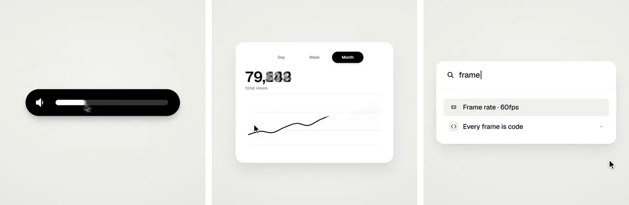 Frames from zero’s post (12,044 likes, 14 seconds, 1:1).
Dribbble-level UI motion. One shape, never cut: every state is the same element morphing its size, radius and color while its content swaps with a short blur. A cursor drives every change with real clicks and drags.
A single black element becomes a button, a checkmark, a music player, a volume slider, a toggle, a set of tabs, a chart, a ⌘K command palette, and a toast, then turns back into the button. A cursor triggers each change in time with a 120 BPM track, and the last frame matches the first, so the clip loops without a seam.
Two choices make it work. Keeping one continuous object on screen holds attention across fourteen seconds, and the prompt fixes the tempo (“120 BPM, 7 bars, something happens on every beat”), which gives every morph a place to land. The states are generic, so for your own app you would swap in real screens. Tellcut’s Product walkthrough template is built for that version: a cursor clicking through your interface.
Social Ads and Brand Bumpers
6. A Vertical Social Ad for a Fintech Product
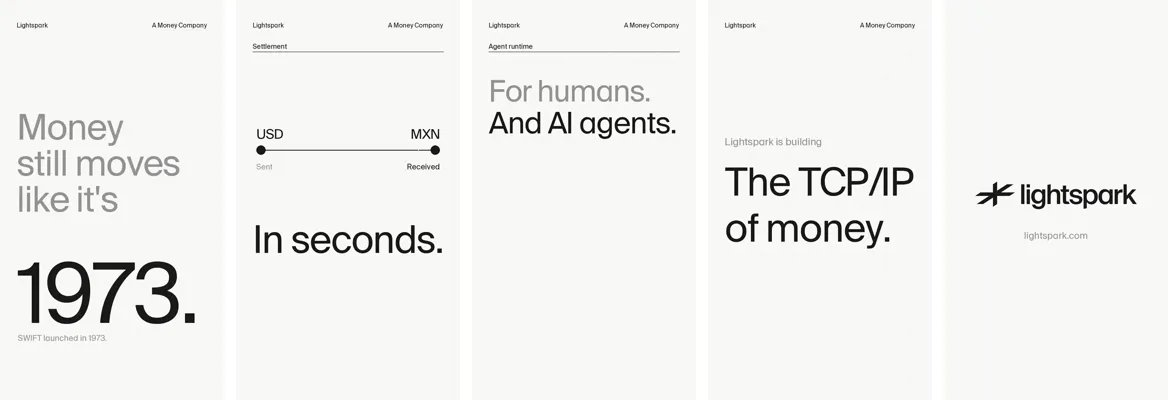 Frames from David Marcus’s post (283 likes, 23 seconds, 9:16).
make a punchy and modern short video for social that promotes @lightspark capabilities. Needs to be production grade with sound
Large type on a light grid, one idea per screen: “Money still moves like it’s 1973,” a USD-to-MXN transfer completing “In seconds,” then “For humans. And AI agents” and “The TCP/IP of money” before the logo. The contrast between a 1973 date and an instant transfer carries the pitch, and every line reads on a phone with the sound off.
7. A 20-Second Kinetic Identity Bumper
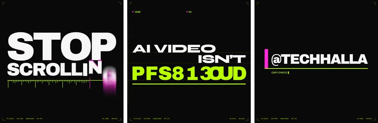 Frames from TechHalla’s post (270 likes, 20 seconds, 1:1).
DURATION: exactly 20.00 seconds. LOOPABLE: frame 0 == frame last (position, opacity, cursor if any). FORMAT: one HTML file, 1080×1080 (square, X-native). 60fps. PALETTE (strict): bg #0A0A0A, magenta #FF2BD6, acid green #B8FF00 […] No other hue
Heavy white type on black, scrambled acid-green characters resolving into words, and a handle that types itself out over a magenta bar. The prompt gets that look from numbers: an exact 20.00-second loop, 60fps, and three hex codes with “no other hue.” Swap in your own palette and keep the precision. With that little room for content, a bumper like this works best as an intro or outro.
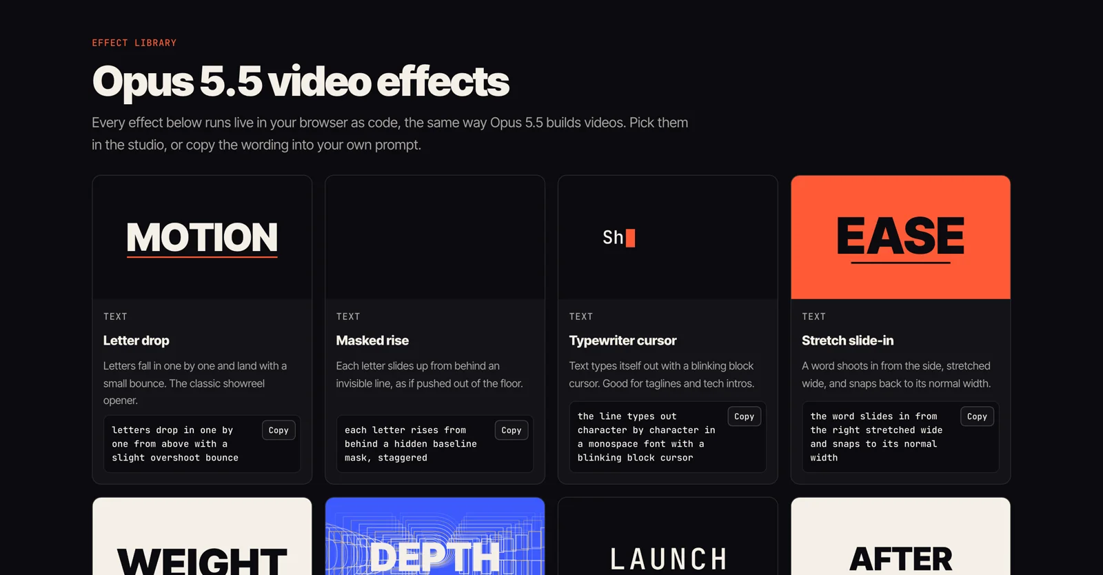
For short branded pieces, Tellcut offers 9:16 and 1:1 formats and a Logo reveal template. Its effect library lists motion styles like the ones above (letter drop, decode scramble, stretch slide-in) with exact wording to paste into a prompt.
Explainers and Data Stories
8. A Cocktail Recipe, Measured Step by Step
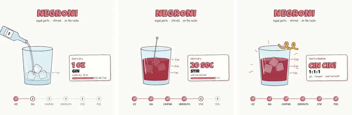 Frames from Rory Flynn’s post (1,025 likes, 30 seconds, 1:1).
We’re going to try a little test. Do you think you could render a recipe motion graphic animation using javascript or html (w/e you think will produce the best) to show the full recipe from start to finish (empty glass to completed cocktail) - Explainer video style - Showing the recipe ingreidents + measurements as they’re going into the cup. Should be a 30s video.
Rory never named a cocktail, so Opus chose a Negroni. A hand-drawn glass fills layer by layer with measurement ticks along its side. A step card shows “1 oz GIN” or “20 SEC STIR,” and a six-step tracker along the bottom checks off ice, gin, Campari, vermouth, stir, and peel as they happen.
That tracker is the part to borrow. Any step-by-step video gets easier to follow when viewers can see where they are in the process. If you need a specific recipe or product, name it, or the model will pick one for you.
9. Recursion Explained in a Different Style Every Scene
 Frames from Ethan Mollick’s post (554 likes, 75 seconds).
A video explaining recursion, where every explanation about recursion has a radically different video style, make this self-referential & clever & fast moving.
Each explanation nests inside the one before and switches genre: corporate explainer, nature documentary, movie trailer, kids’ TV. A “call stack” bar across the top grows deeper with every layer, and the video ends playing inside itself under “STILL CONFUSED?” A concept about self-reference gets taught by a video that references itself.
10. Key Moments in the History of AI
 Frames from klöss’s post (192 likes, 2 minutes 52 seconds).
make a video highlighting key moments in the history of AI.
From that one line, Opus built a dark, orange-accented timeline in numbered chapters: the 1943 artificial neuron drawn as a logic diagram, ELIZA’s 1966 dialogue typed on a terminal, a bar chart for the 2012 ImageNet results. A caption line at the bottom carries the narration, and the closing card credits motion design, sound design, and code to Claude. Timelines suit code animation because each moment is text, a number, or a simple diagram.
Opus wrote every date and figure on its own, so fact-check them before you publish an explainer like this.
Explainers like these three, built from text, numbers, and diagrams, play to what code animation does well. Tellcut has Explainer, Data story, and Recipe & how-to templates for this kind of video. Each video there runs up to 30 seconds, so a longer explainer like #9 or #10 has to be split into parts.
Story and History Animations
11. Humanity’s Story as an Origami Doodle
 Frames from songkeys’s post (423 likes, 1 minute 48 seconds).
Create a short origami / doodle-style animation showing humanity’s development, progress, and civilization from birth to the present, and ultimately the hatching of AI. […] Style: doodly, cute, warm, strongly narrative, no spoken language (simple text is OK, but don’t use too much explanatory/narrative text, because I want different civilizations to be able to understand it), poetic, moving, high quality.
Soft paper-cut hills at sunrise give way to a first village, then the Earth at night strung with glowing icons, network lines spreading over a village, and a final sketchbook page where a pencil draws a small creature. Asking for “no spoken language” pushed the whole story into pictures, so the video works in any market without translation.
12. 250 Years of U.S. History as a Sand Animation
 Frames from Michael Guo’s post (349 likes, 2 minutes).
Make a 2-minute sand animation that tells the story of 250 years of U.S. history. Keep it lively, engaging, and tasteful. Add appropriate background music and sound design.
Grainy sepia silhouettes, with a year in the corner of each scene: wagons heading west in the 1840s, a steamship passing the Statue of Liberty in 1886 under the line “Give me your tired, your poor…”, the crowds of 1963, and fireworks over “250, 1776–2026.” The two words “sand animation” got sepia grain, silhouettes, and scene changes that look like sand being swept.
13. Four Seasons Outside a Train Window
 Frames from Ole Lehmann’s post (264 likes, 30 seconds).
4 seasons passing outside a train window, a cozy carriage, a cup of coffee on the table, Grand Budapest Hotel style
A fixed, symmetrical frame of purple curtains, two table lamps, and a coffee cup stays still while the landscape outside moves through spring, summer, autumn, and winter and back to blossom, with a pink hilltop palace in the distance. Naming the film gave Opus the symmetry, the pastel palette, and the pink building in four words.
All three story animations name a medium or a reference: origami, sand, a Wes Anderson film.
What These Examples Have in Common
The one-line showreel prompt produced polished reels that could belong to anyone. The launch videos that look like a real company had real context: a product, screenshots, a palette, supplied photos or footage. As Rexan Wong put it, “everyone has the same model. the context you give it is what makes it look pro” (post, 6,730 likes).
Six of the 13 prompts set a duration or tempo, and they include the two most-liked videos here (#1 and #5). Across all 475 public videos, half run between 15 and 43 seconds. Without one, Opus picks the length itself: klöss’s one-line history prompt set no duration and came back at nearly three minutes.
The creators also named styles: origami, sand animation, Grand Budapest Hotel, Apple keynote, Dribbble-level UI motion. Each name implies a palette and a pace that would otherwise take a paragraph to describe.
The longest prompts plan before they animate. They ask for a beat map, a state list, or still frames before any code is written, so problems surface while they are still cheap to fix.
Effort varies a lot. The fastest took about a minute and $2 (Deedy Das); the slowest, about eight hours for a launch video with a soundtrack written in code (Leon Lin). In between: 15 minutes (Chain), 19 minutes with two revisions (David Ch), and three prompts (Miles).
What Opus 5.5 Videos Can’t Do
- It can’t film anything. For a real-looking person or place, use a video generation model such as Veo or Seedance, or a camera. Opus can then cut that footage and add type and graphics on top, but only in a setup that can load your video files, such as Claude Code with Remotion, whose
<OffthreadVideo>component places video clips inside a composition. Tellcut creates videos from a description and doesn’t take video input. - It won’t record a real song or voiceover. In #4 and #5 the creators supplied the music and Opus timed the animation to it. Opus can also write audio in code, as Leon Lin did for a full soundtrack and sound effects, but a recorded song or voiceover still has to come from somewhere else.
- It doesn’t know your brand. Without a reference, a logo, and a palette, the result drifts toward the same centered-text look.
Make Your Own Opus 5.5 Video
Pick a starting point based on what you have:
- To see what it can do, run the showreel prompt from #1.
- To announce a product, use the launch structure from #2 to #4 with your product name, three features, and brand colors.
- For more than 30 seconds, or to use your own footage and audio, work in Claude Code with a renderer like Remotion or HyperFrames.
Set It Up Yourself
Use Claude Code with a render pipeline that loads the HTML in a headless browser, captures each frame, and encodes it with ffmpeg. The Hugging Face walkthrough covers the details. This route handles long videos, audio, and footage.
Use a Browser Tool
Tellcut runs Claude Opus 5.5 for you, so you don’t need a Claude subscription or a local setup. Describe the video or start from a template such as Designer showreel, App launch video, or Product walkthrough, then pick 16:9, 9:16, or 1:1 and a length of 10, 15, or 30 seconds. Opus 5.5 plans a storyboard and writes the scenes; you refine them in chat and download a 1080p MP4. Videos come out silent, so add music in your editor.
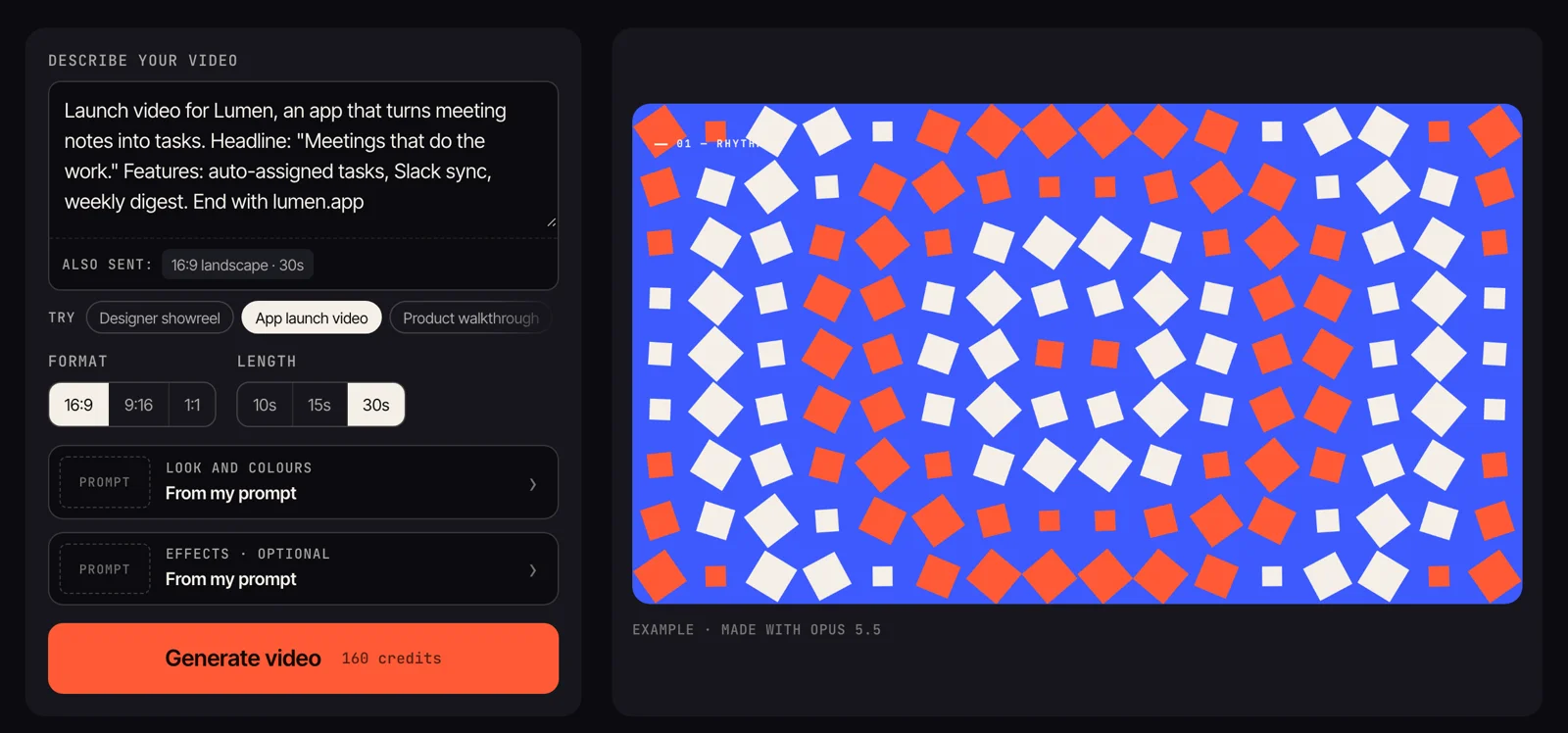
Browse more finished videos with their prompts in the Tellcut examples gallery, or start your first Opus 5.5 video.
FAQ
How Long Can an Opus 5.5 Video Be?
There’s no fixed limit when you render it yourself; the examples above run from 14 seconds to almost 3 minutes. Longer videos take longer to render, since every frame is drawn and captured one at a time. On Tellcut, each video is up to 30 seconds.
Can I Reuse These Prompts?
Yes, as a starting point. Swap in your own product, subject, and palette. The videos themselves belong to their creators, so link to the original posts.
Make your own Opus 5.5 video
Describe it in a sentence. Opus 5.5 writes the storyboard and code, and you export an MP4.
Open the studio