
Claude Opus 5.5 makes a video by writing code, and every decision your prompt leaves open gets filled with one of its defaults. Asked for frontend work without design direction, Opus 5.5 falls back on a few default styles, and a general “avoid a generic AI look” mostly swaps one default for another. A prompt that produces something distinctive makes the decisions you care about (format, content, structure, look, motion) and names the defaults you don’t want. After the first render, add whatever default it reached for to that list and run it again.
Most shared prompts leave nearly all of those decisions open. Most of the Opus 5.5 video prompts people post are short. Among those of roughly 100 words or fewer, the median is 26 words and more than a quarter are a single sentence. Fewer than 2% of them say anything about color.
How Opus 5.5 Turns a Prompt Into a Video
In the common setup, Opus 5.5 writes one self-contained HTML file using Canvas, SVG, GSAP or Three.js. A headless browser draws that file one frame at a time, and the frames are encoded into an MP4. Your prompt therefore controls what code can decide: the words on screen, colors, layout, typography, motion and timing. It can’t film a scene or record a voice, so those requests belong to other tools.
Anthropic lists the defaults Opus 5.5 reaches for in frontend work, such as cream backgrounds and pill-shaped buttons. In video, the most familiar default is centered text on a gradient with everything fading in.
How much you write depends on where you run it:
- In Claude or Claude Code, the prompt also carries the render rules: one HTML file, every frame drawn as a pure function of time through a
seek(t)function, and no timers or CSS animations, so a renderer can capture any frame in any order. - On Tellcut, those rules are already set. The tool assigns the motion-designer role, asks Opus for a storyboard before any code, enforces the rendering contract, and adds baseline craft such as varied rhythm, clear type hierarchy and a definite ending. Format and length are buttons, the look can come from a preset or up to three brand colors, and up to four named effects can be attached. The brief holds up to 2,000 characters, and videos come out silent. What’s left for your brief is content and design.
The Six Parts of an Opus 5.5 Video Prompt
Format: Length, Frame, and Where It Plays
Format sets the duration, the aspect ratio, and how the video will be watched: on a phone with the sound off, as a five-second intro, or as a landing-page loop. Write it first. Without a length, Opus picks one: the one-line history of AI prompt came back at nearly three minutes.
A 15-second 16:9 launch video for a product page, readable with the sound off.
Content: The Exact Words, Names, and Numbers
Given only “Make a launch video for my plant care app,” Opus named our test app “Verdant” and ended on a “Download free” card dated spring 2026. Anything a viewer reads (the product name, the headline, the features, the figures) gets invented when you don’t supply it. A one-line launch prompt for a real product priced it in dollars when the product uses pounds and redrew the app from imagination.
Write the copy exactly as it should appear, in quotation marks. For explainers, supply the dates and numbers or check every one Opus writes before you publish.
Headline: “Your plants, finally on schedule.” Features: snap a photo to identify any plant; a watering reminder for every pot; a care log that shows what worked.
The most reused Opus 5.5 prompt is the showreel one-liner. Posts that used it unchanged have a median of 3 likes; posts that added their own product, topic or music to the same sentence have a median of 34. That prompt and twelve other finished videos, each with its full prompt, are collected in Opus 5.5 Video Examples, also published on DEV, Medium, Substack and Blogger.
Structure: Beats and the Final Frame
Structure says how many beats the video has, what happens in each, and how it ends. Give the final frame a job and a duration, because a video that stops mid-motion feels unfinished.
Open on a drooping houseplant in the first second, reveal the Fernly name, one beat per feature, then end on a card with the headline and fernly.app, held for the last 2 seconds.
Look: A Named Reference, a Palette, and a Type Rule
The look takes three decisions, and shared prompts rarely make the last two.
- A named reference. “Swiss botanical poster” gave our test video flat, poster-like shapes. “Sand animation”, “origami” and “Grand Budapest Hotel” each set a whole visual world in two or three words.
- Exact colors. Give hex values with a role for each, and add “No other hue” when nothing else should appear. All three hex values in our test came out exactly as written.
- A typeface by name. Anthropic’s design guidance names Inter, Roboto and Arial as overused defaults. Pick a face with some character and give it a role: one for headlines, one for small labels. Archivo Black and Archivo, named in our brief, are what rendered.
Look: a Swiss botanical poster. Background #10352A, accents #8FD694 and #F2B134, all type in white. Archivo Black for headlines, Archivo for small labels. Big type on a strict left-aligned grid.
Motion: Tempo and Transition Rules
“Punchy” leaves both speed and transitions to Opus. With a tempo in beats or seconds, every change lands on a count, as in the UI video that used “120 BPM, 7 bars, something happens on every beat”. A transition rule removes the fade-in default: “Every scene is made out of the previous one: nothing fades, blurs or cuts”. Add one place to hold still, so the pace has contrast. A transition you describe in detail gets built: in our test, the leaf-into-F-into-phone transition from the brief appeared on screen.
Motion: 120 BPM, something changes on every beat. Each scene grows out of the previous one. Fast cuts, with one held beat on the headline.
Defaults to Avoid
Name the specific patterns you don’t want. A general “no AI slop” gets you a different default; a list of named patterns removes them. Start with these:
- centered text on a gradient
- everything fading in
- an ending that is only a logo
- cream or off-white backgrounds
- italic accent words
- numbered 01/02/03 labels
- small uppercase labels above every headline
- pill-shaped buttons
- a glow on a dark background
About one in twelve of the short prompts people share includes any “no” or “avoid” instruction.
Put together, the six parts fit in a short block you can fill in:
Format: [length], [aspect ratio], watched [where and how].
Content: [product or topic]. Headline: "[exact words]". [Features, facts, numbers].
Structure: [opening beat], [middle beats], end on [final frame], held for [seconds].
Look: [named reference]. Background [#hex], accents [#hex] and [#hex]. [Typeface] for headlines, [typeface] for labels.
Motion: [tempo]. [Transition rule]. Hold on [moment].
Avoid: [default], [default], [default].
One Brief, Three Versions on Tellcut
We ran the same launch video three times on Tellcut for a fictional plant-care app called Fernly. Every run used 16:9, 15 seconds, the “From my prompt” look, and no template or effects, so only the brief changed. Each generation took about 75 seconds.
Version 1: The Topic Only
Make a launch video for my plant care app.
 Version 1: the name, the release date and the features are all invented.
Scenes alternated between a dark green radial gradient and a cream background, with serif headlines, and the features were Opus’s own. The end card added a pill-shaped button.
Version 2: Content and Structure
The brief gave the name, the headline, three features, and a beat-by-beat structure with a held end card, 82 words in all.
 Version 2: every word is right, and the look is Opus’s defaults.
Every word, feature and beat came out as written, including the end card held for the last two seconds. The look came straight from the default list: a cream background, numbered “01 / 02 / 03” labels, a pill-shaped button and Inter for body text.
Version 3: Look, Motion and an Avoid List
The brief kept everything from version 2 and added three lines, 192 words in total.
Look: a Swiss botanical poster. Background #10352A (deep fern green), accents #8FD694 (leaf green) and #F2B134 (pollen yellow), all type in white. One typeface: Archivo Black for headlines, Archivo for small labels. Big type on a strict left-aligned grid. Motion: 120 BPM, something changes on every beat. Each scene grows out of the previous one: the drooping leaf straightens into the F of Fernly, and the F’s stem becomes the phone outline. Fast cuts, with one held beat on the headline. Avoid: centered text on a gradient, everything fading in, cream or off-white backgrounds, italic accent words, numbered 01/02/03 labels, neon glow, and an ending that is only a logo.
 Version 3: the colors, typeface, grid and transitions follow the brief.
The three colors, the typeface and the grid all appear as written, and the transitions followed the brief: the drooping leaf straightened into the stem of a giant “F”, and the F folded into the phone outline. No cream background, centered gradient text or numbered labels appeared. Two new problems did. Opus kept a small label above every headline and swapped the banned numbers for uppercase words (“DAY 9 · NO WATER”, “ANY PLANT, ONE PHOTO”), with dash page indicators in the corner. And the layout slipped twice: the wordmark ran off the right edge at 3.4 seconds, and the end-card plant overlapped the headline.
| Version | Added to the brief | What changed | What was still wrong |
|---|---|---|---|
| 1 | The topic | A finished launch video | Invented name, date and features; gradient and cream end card |
| 2 | Name, headline, features, structure | Every word and beat correct | Cream background, 01/02/03 labels, pill button |
| 3 | Look, motion, avoid list | Colors, type, grid and transitions as written | Labels swapped to uppercase words; two layout slips |
Fill-in Prompts for Four Common Video Types
Replace the bracketed text, keep the structure, and change one part at a time when the result isn’t what you want.
Product Launch
Have ready: the product name, the headline, three features in a few words each, the URL, and two or three brand colors.
A 30-second launch video for [Product], [what it does in one line].
Headline: "[headline]". Features: [feature 1]; [feature 2]; [feature 3].
Structure: a hook in the first second, the product name, one beat per feature with a simple product-screen illustration, then an end card with the headline and [url], held for the last 3 seconds.
Look: [named reference]. Background [#hex], accents [#hex] and [#hex]. [Typeface] for headlines, [typeface] for labels.
Motion: [tempo]. Each scene grows out of the previous one. One held beat on the headline.
Avoid: centered text on a gradient, everything fading in, cream backgrounds, numbered 01/02/03 labels, pill-shaped buttons.
Settings: 16:9, 15 or 30 seconds. For more energy, change Motion first; for a different mood, change the named reference. Finished launch videos with their prompts: examples #2 to #4. Tellcut’s Product launch template starts from this structure.
App Walkthrough
Have ready: the three or four actions to show, and a description of each screen: the sidebar items, list names and button labels. Opus draws the interface from your description, so the more exact the screen text, the more it looks like your product.
A 30-second walkthrough of [App], [what it does].
Show these actions in order: [action 1], [action 2], [action 3]. A cursor performs each one with a real click or drag.
Screens: [screen 1: sidebar items, header, list contents]; [screen 2: ...].
End on "[closing line]" over the final screen, held for 3 seconds.
Look: [your app's real colors as #hex], [your app's typeface]. Keep the interface flat and exact, no glassy reflections.
Motion: zoom in on each click, hold for one beat after every state change.
Avoid: invented features, placeholder text, a logo-only ending.
Settings: 16:9, 30 seconds. For a more ambitious version, one shape can morph through every state.
Vertical Social Ad
Have ready: one claim, one number or contrast that proves it, and the call to action.
A 15-second vertical ad for [Product]. It must read with the sound off.
Hook in the first second: "[hook line]". Then "[claim]", then "[proof]", then "[call to action]".
One idea per screen, big type, at least half the screen height for the main line.
Look: [named reference]. Background [#hex], text [#hex], one accent [#hex]. [Typeface].
Motion: a hard cut every 2 seconds, one held beat on the proof.
Avoid: centered text on a gradient, everything fading in, small captions.
Settings: 9:16, 15 seconds. The fintech ad in the examples builds its whole pitch on one contrast: “Money still moves like it’s 1973.”
Explainer
Have ready: the steps in order and every fact, date and number you want on screen.
A 30-second explainer: [topic] in [number] steps.
Steps: 1. [step]. 2. [step]. 3. [step]. Use only these facts: [facts and numbers].
Structure: a title card, one step per scene with a diagram that builds up, a progress tracker showing which step we're on, then a one-line summary held for 3 seconds.
Look: [named reference, e.g. a technical manual or a chalkboard]. Background [#hex], diagram lines [#hex]. [Typeface].
Motion: each diagram draws itself in, then holds for one beat before the next step.
Avoid: invented numbers, centered text on a gradient, everything fading in.
Settings: 16:9, 30 seconds. A step tracker like the Negroni recipe’s keeps viewers oriented. On Tellcut, a video longer than 30 seconds has to be split into parts.
How to Revise a Video Prompt
Read the Storyboard Before the Video
Tellcut shows Opus’s storyboard while the code is still being written. Version 2’s storyboard opened with “Warm cream background, a terracotta pot centre-left” before a single frame existed. If the storyboard is wrong, stop and change the brief before the code is written.
Fix One Kind of Problem per Round
Point to the time. “At 3.4 seconds” or “from 13.5 seconds” tells Opus exactly where to look, and a round that handles one kind of problem leaves the rest of the video alone.
Describe the Problem and the Result You Want
Leave the fix to Opus. A note that prescribes a fix gets that fix, whether or not it solves the problem. Our first edit to version 3 named both layout problems and the outcome:
Two layout problems. At 3.4s the Fernly wordmark runs off the right edge of the frame. From 13.5s the potted plant on the end card overlaps the end of “schedule.”. I want the whole wordmark inside the frame with clear margin, and the plant fully clear of the headline so the end card reads cleanly. Keep everything else as it is.
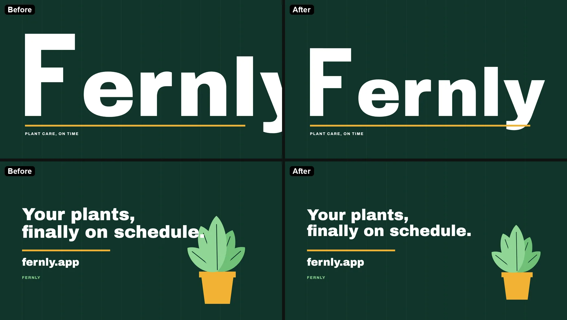 One message fixed both layout problems and left the rest of the video unchanged.
Add Each New Default to the Avoid List
Check which default the result used in place of the ones you listed, and add it to the list. The second edit added version 3’s new default:
Add two more things to the avoid list: small uppercase labels above the headlines (“DAY 9 · NO WATER”, “ANY PLANT, ONE PHOTO” and the rest), and the dash page indicators in the bottom-left corner. Remove both. Keep everything else as it is.
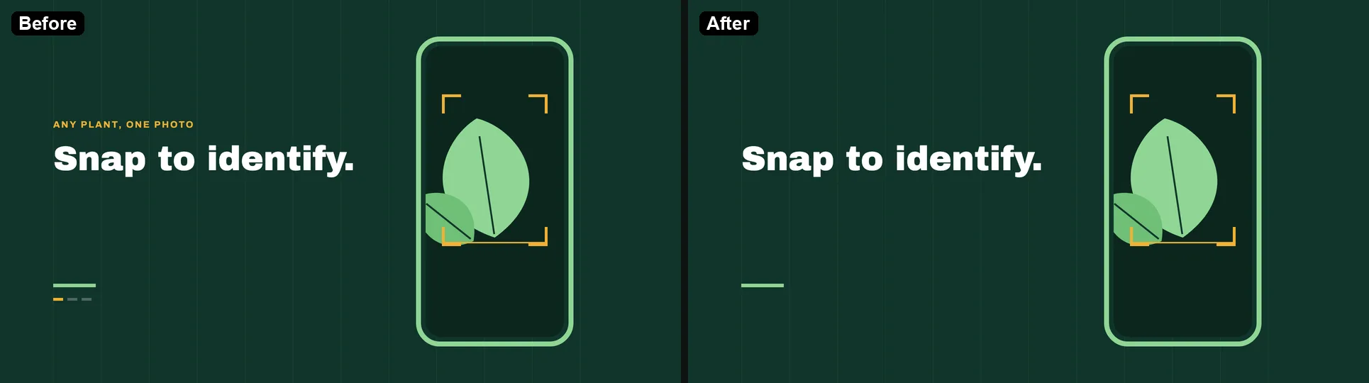 The labels and indicators are gone; nothing else moved.
Each edit took under a minute.
Report a Preview That Never Loads
The code Opus writes can fail to run. One of our three generations stalled on “Loading preview…” because the script declared the same variable twice. One chat message describing the error and asking for no other change fixed it in about 40 seconds.
Stop When the Video Does Its Job
Some problems no prompt can fix: real footage, a recorded voiceover, a licensed song, or a runtime past the tool’s limit. Tellcut videos run up to 30 seconds and come out silent, and Tellcut loads fonts from Google Fonts and public CDNs only, so a private brand font file won’t load. For footage, audio or long cuts, work in Claude Code with a renderer such as Remotion, which can place your own video and audio files in a composition with its <Video> and <Audio> components.
FAQ
How Long Should an Opus 5.5 Video Prompt Be?
Long enough to cover the six parts. The version 3 brief does it in 192 words; the short prompts people share have a median of 26. On Tellcut the brief holds up to 2,000 characters, and format and length are set with buttons.
Make your own Opus 5.5 video
Describe it in a sentence. Opus 5.5 writes the storyboard and code, and you export an MP4.
Open the studio